Introduction:
In today’s fast-paced digital world, users expect seamless online experiences—regardless of the device they use. With more than 70% of global internet traffic coming from mobile devices, having a responsive website in 2025 isn’t optional—it’s a necessity.
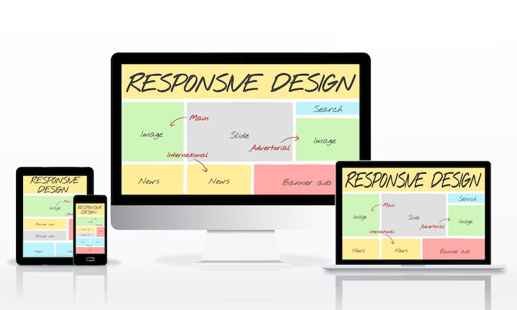
What is a Responsive Website?
A responsive website is designed to automatically adjust its layout, content, and features to fit various screen sizes and devices. Whether your visitor is using a phone, tablet, or desktop computer, they’ll have an equally smooth and functional experience.
Why It’s Crucial in 2025:
1. Mobile-First Indexing by Google
Google now prioritizes mobile-friendly websites in search rankings. If your site isn’t responsive, your visibility and traffic may take a hit.
2. Improved User Experience
A responsive design ensures that buttons, text, and images are readable and usable on any screen. This leads to longer site visits and higher conversion rates.
3. Faster Load Times
Optimized responsive websites load quicker on all devices. And in 2025, users won’t wait more than 2–3 seconds for a page to load.
4. Future-Proofing Your Business
Responsive websites adapt easily to new tech—foldable devices, smart TVs, and even wearables. One design, endless flexibility.
Key Benefits of a Responsive Website:
- Increased website traffic from mobile users
- Lower bounce rates and higher engagement
- Better SEO performance and higher rankings
- Simplified website management and cost-efficiency
- Enhanced brand perception and credibility
Final Thoughts:
As technology evolves, so do user expectations. A responsive website ensures you don’t fall behind your competitors in 2025. It’s not just a web design trend—it’s the backbone of your business’s digital success.
